
Getting Started with Bayesian Optimization (NEXTorch)
I recently showed you how to use BayBE, a Python package for Bayesian Optimization. Now I want to show you another library for Bayesian Optimization: NEXTorch.
I’ll cover the same example as in the BayBE blog post, but using NEXTorch instead, so you can directly compare the two frameworks. Keep in mind that this is only a simple example. BayBE is much more sophisticated and has a lot more features. NEXTorch is a more basic tool. But it’s also more straightforward to use. At least in the sense that the documentation is not as overwhelming.
For more information about NEXTorch, check out the NEXTorch documentation. I’ve also created an AI assistant for NEXTorch that can generate Python scripts for you. You can find it here.
One major downside of NEXTorch is that it’s not as actively maintained as BayBE. It works, but there are some issues with certain plotting functions that I’ll show you later. Nothing critical, and there’s an easy workaround.
How NEXTorch structures the workflow
NEXTorch organizes everything around an Experiment object. An experiment contains your search space definition (as ranges), your initial data from a design of experiments, and the optimization settings. You can either run a fully automated optimization loop or manually generate the next experiments one at a time.
The workflow looks like this:
- Define what you’re searching over (parameter ranges)
- Generate initial data using a DOE method (Latin Hypercube, full factorial, or random)
- Create the experiment object and configure optimization settings
- Run the optimization: either automatically or step by step
- Visualize results
I’ll work through a concrete example using the same objective function from the BayBE tutorial so you can directly compare the two frameworks.
Step 1: Define the objective function
For this tutorial, we’ll use the same test function as in the BayBE post. This allows you to compare how both frameworks perform on identical problems.
import numpy as np
import pandas as pd
import matplotlib.pyplot as plt
from nextorch import bo, doe, utils, plotting
def yield_fn(X):
"""
Objective function that simulates a yield optimization problem.
Takes a 2D array where each row is [xi1, xi2].
Returns an array of yield values.
"""
X = np.atleast_2d(X)
results = []
for row in X:
xi1, xi2 = float(row[0]), float(row[1])
x1_t, x2_t = 3 * xi1 - 15, xi2 / 50.0 - 13
c, s = np.cos(0.5), np.sin(0.5)
x1_r = c * x1_t - s * x2_t
x2_r = s * x1_t + c * x2_t
y = np.exp(-x1_r**2 / 80.0 - 0.5 * (x2_r + 0.03 * x1_r**2 - 40 * 0.03)**2)
results.append(100.0 * y)
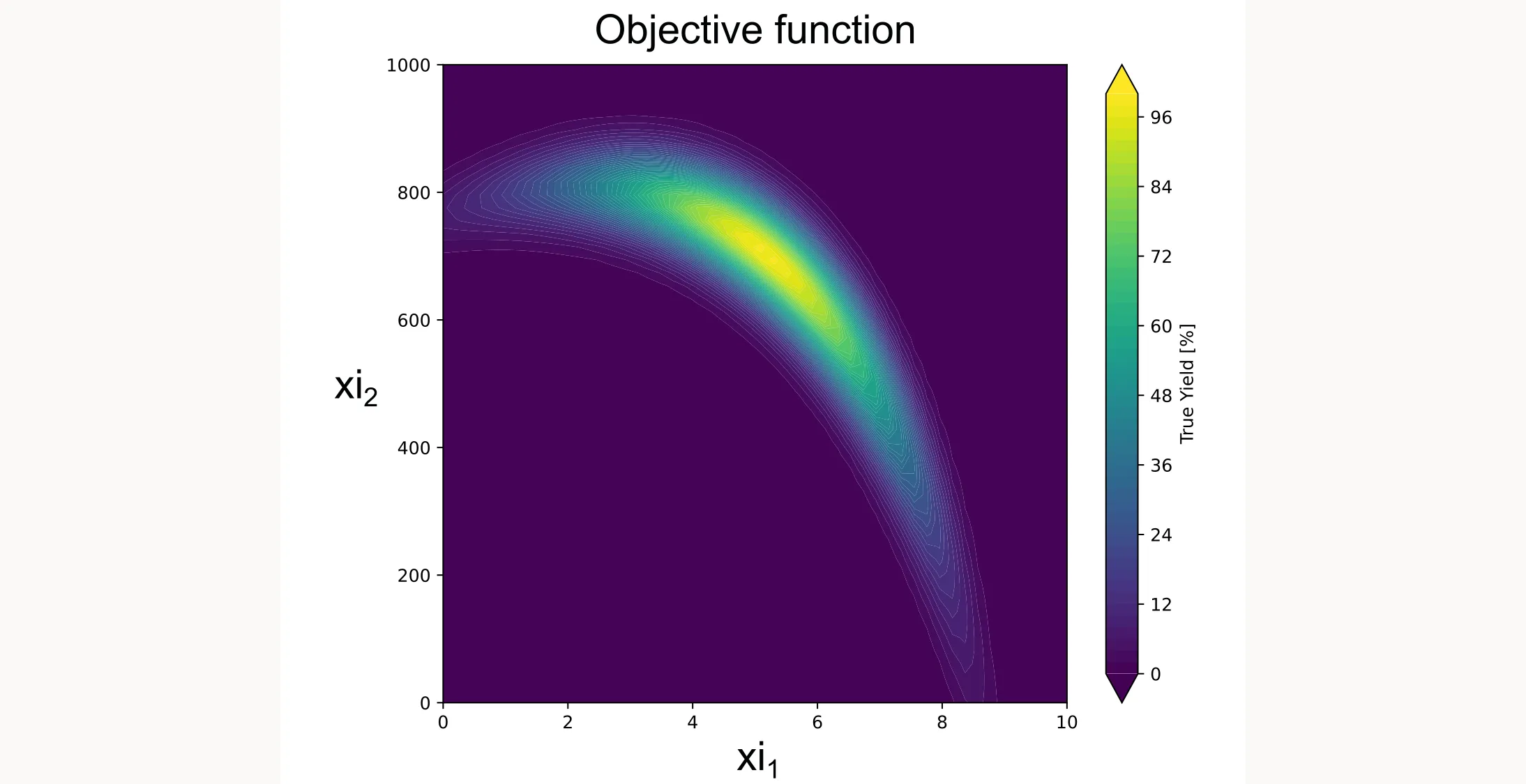
return np.array(results).reshape(-1, 1)This function creates a smooth landscape with a global optimum, similar to what you might see with temperature and concentration effects in a real chemical system. I plotted it as a contour plot below.
Step 2: Define the search space
In NEXTorch, you define parameter ranges as a list of [min, max] pairs:
X_ranges = [[0, 10], [0, 1000]]
X_names = ['xi1', 'xi2']
Y_name = ['yield']
n_dim = len(X_names)
For this tutorial, xi1 and xi2 are generic parameters. In your real application, these might be temperature, concentration, reaction time, or any other continuous variables you can control.
NEXTorch also supports ordinal parameters (discrete ordered values like stirring speeds) and categorical parameters (like catalyst types), but unlike BayBE, it doesn’t come with built-in support for chemical descriptors. This is what I mean when I say NEXTorch is less sophisticated but also easier to start with, since there aren’t as many options to choose from.
Step 3: Generate initial data with DOE
Bayesian optimization needs initial data to train the surrogate model. You can’t optimize without some observations first. NEXTorch has built-in DOE methods to generate your initial design.
n_init = 3
X_init = doe.latin_hypercube(n_dim=n_dim, n_points=n_init, seed=42)
The latin_hypercube function generates points in unit scale [0,1]. We need to convert them to real scale:
X_init_real = utils.inverse_unitscale_X(X_init, X_ranges)
Y_init_real = yield_fn(X_init_real)
For initial experimental design, Latin Hypercube Sampling (LHS) is generally preferred over Full Factorial designs because it avoids the “curse of dimensionality” while providing excellent space-filling properties with a flexible sample size. In NEXTorch, you can implement this via doe.latin_hypercube(), though doe.full_factorial() and doe.randomized_design() are available for specific use cases. Because LHS is fundamentally designed for continuous unit hypercubes, a Full Factorial approach is often better for categorical variables. This ensures that all discrete factor levels are explicitly represented in the initial data.
Step 4: Create the experiment and configure settings
Now we bundle everything together into an Experiment object:
exp = bo.Experiment("YieldOptimization")
exp.input_data(
    X_real=X_init_real,
    Y_real=Y_init_real,
    X_ranges=X_ranges,
    X_names=X_names,
    Y_names=Y_name
)
exp.set_optim_specs(
    objective_func=yield_fn,
    maximize=True
)
Let me break down what’s happening here:
exp.input_data() loads your initial experimental data:
X_real: Your input values in real units (the actual parameter values you used)Y_real: Your measured responses (what you observed)X_ranges: The bounds for each parameter as [min, max] pairsX_names: Names for your parameters (for plotting and output)Y_names: Name of your response variable
exp.set_optim_specs() configures the optimization:
objective_func: The function to evaluate (only needed for automated optimization, leave it out for human-in-the-loop)maximize: Set toTrueif you want to maximize the response,Falseto minimize
NEXTorch uses a Gaussian Process surrogate by default. The acquisition function defaults to
'EI'(Expected Improvement), which is excellent for most applications (Note: Use qEI for batch optimization as I did). You can specify a different acquisition function when running trials.
Step 5: Run the optimization loop
NEXTorch offers two approaches for optimization:
Option A: Fully automated optimization
If you have an objective function that can be evaluated programmatically (like our test function), use run_trials_auto:
exp.run_trials_auto(n_trials=12, acq_func_name='qEI')This runs 12 additional trials (on top of your 3 initial points, giving 15 total), automatically selecting the next point, evaluating it, and updating the model.
Option B: Human-in-the-loop optimization
For real lab experiments where you can’t automate the evaluation, use generate_next_point:
for i in range(12):
    X_new, X_new_real, acq_value = exp.generate_next_point(
        n_candidates=1,
        acq_func_name='qEI'
    )
    print(f"Trial {i+4}: Run experiment at xi1={X_new_real[0,0]:.2f}, xi2={X_new_real[0,1]:.2f}")

    # In a real lab, you would now run the experiment and measure Y_new_real
    Y_new_real = yield_fn(X_new_real)  # Simulated here

    exp.run_trial(X_new, X_new_real, Y_new_real)
The generate_next_point method returns the suggested experiment in both unit scale (X_new) and real scale (X_new_real), plus the acquisition function value. After running your experiment and obtaining results, you update the model with run_trial.
Step 6: Extract and visualize results
NEXTorch has extensive built-in plotting functionality. Here are the most useful visualization functions.
Model performance plots
NEXTorch provides parity plots to assess how well the surrogate model fits the observed data:
# Predicted vs actual values
plotting.parity_exp(exp)

# With 95% confidence intervals
plotting.parity_with_ci_exp(exp)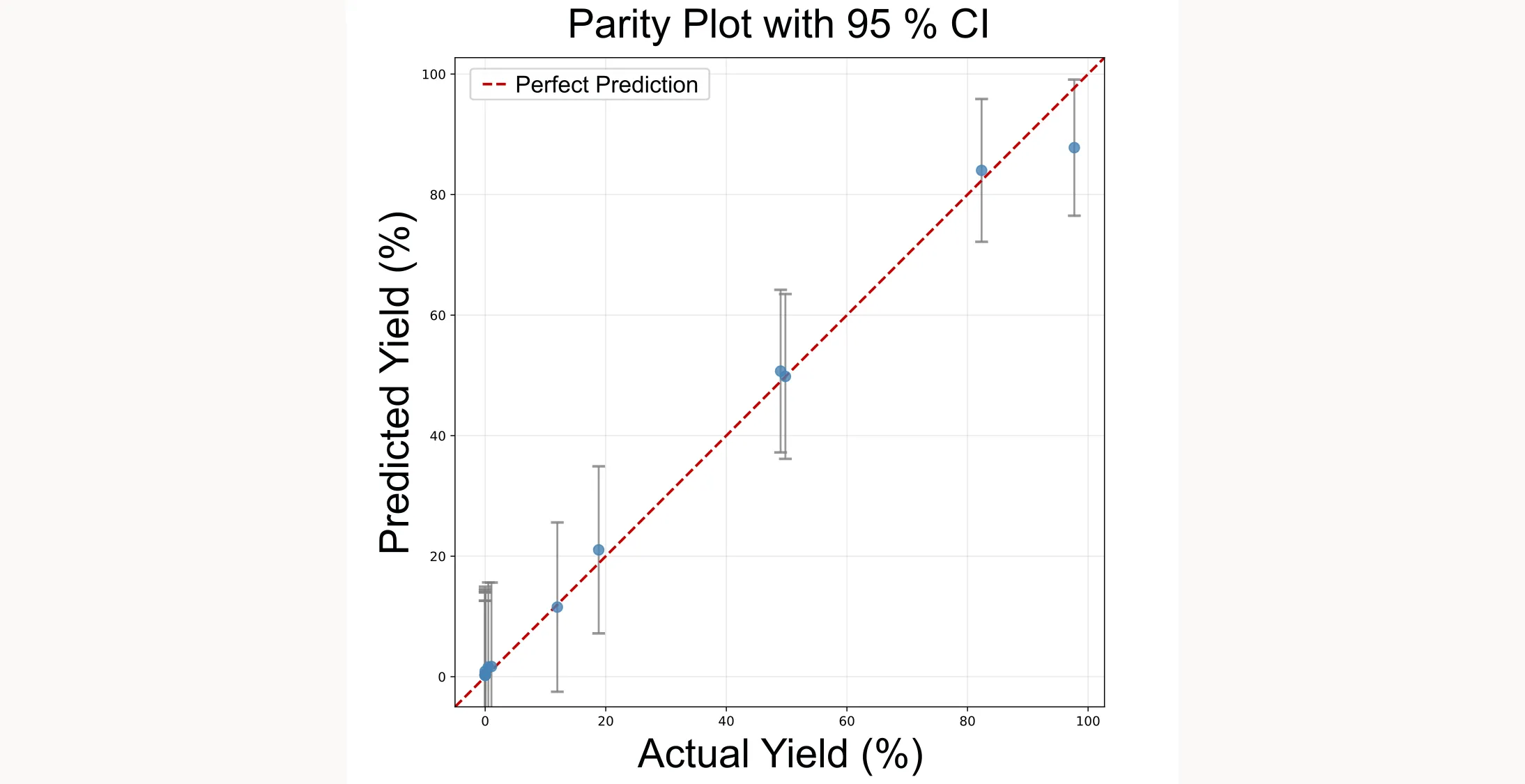
Optimization progress
The discovery curve shows how the optimization progresses over trials:
plotting.opt_per_trial_exp(exp)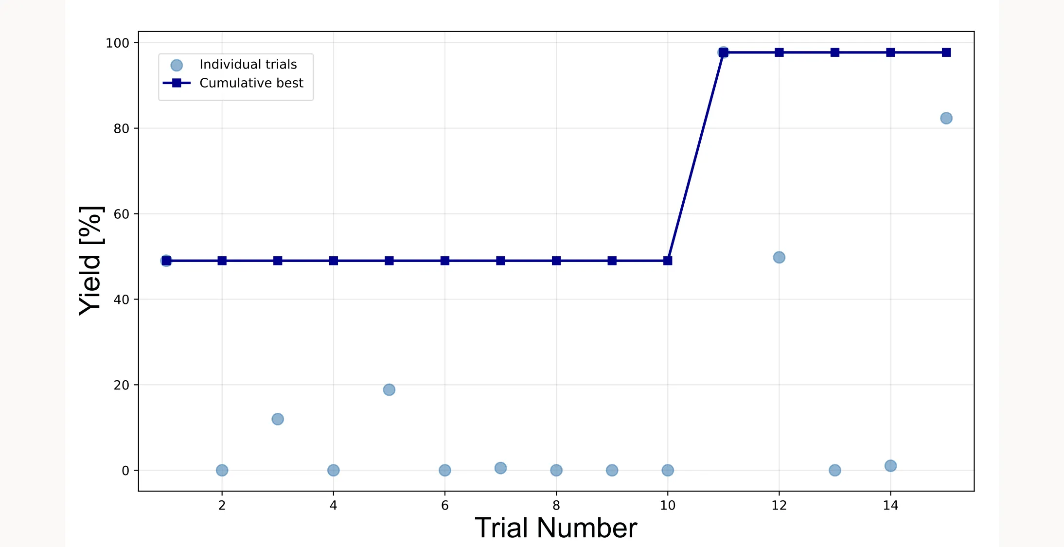
Response surface visualization
NEXTorch has built-in functions for visualizing the surrogate model’s predictions: plotting.response_heatmap_exp() for 2D heatmaps, plotting.response_surface_exp() for 3D surfaces, and plotting.objective_heatmap_exp() for the objective function.
However, I ran into an issue with response_heatmap_exp(). The output didn’t match what I expected based on the surrogate model. I haven’t figured out the root cause yet. It might be a bug in the library or something I’m missing. Since NEXTorch isn’t as actively maintained, these things can happen.
You can easily verify that the GP model itself is working correctly by querying it directly. NEXTorch provides a predict_real() method that lets you get predictions at any point in the design space:
# Define test points
X_test = np.array([
    [5.0, 500.0],  # Center of design space
    [5.0, 700.0]   # High-yield region
])

# Get predictions with 95% confidence intervals
Y_mean, Y_lower, Y_upper = exp.predict_real(X_test, show_confidence=True)

for i, x_val in enumerate(X_test):
    print(f"Input: xi1={x_val[0]}, xi2={x_val[1]}")
    print(f"  Predicted Yield: {Y_mean[i]:.2f}%")
    print(f"  95% Confidence:  [{Y_lower[i]:.2f}%, {Y_upper[i]:.2f}%]")
When I ran this, the predictions made sense. I got higher predicted yield in the region where we know the optimum is. So the surrogate model is learning correctly. It’s just the built-in plotting function that has issues.
Creating a custom heatmap
Since the built-in heatmap didn’t work as expected, I created my own visualization by querying the GP model across a dense grid:
# Create dense grid across design space
steps = 100
xi1_range = np.linspace(X_ranges[0][0], X_ranges[0][1], steps)
xi2_range = np.linspace(X_ranges[1][0], X_ranges[1][1], steps)
X1_grid, X2_grid = np.meshgrid(xi1_range, xi2_range)

# Flatten grid for prediction
X_grid = np.column_stack((X1_grid.ravel(), X2_grid.ravel()))

# Get GP predictions
Y_pred = exp.predict_real(X_grid)
Z_pred = Y_pred.reshape(X1_grid.shape)

# Plot heatmap
plt.figure(figsize=(10, 8))
plt.imshow(
    Z_pred,
    cmap='jet',
    interpolation='gaussian',
    origin='lower',
    extent=[X_ranges[0][0], X_ranges[0][1], X_ranges[1][0], X_ranges[1][1]],
    aspect='auto'
)
plt.colorbar(label='Predicted Yield (%)')

# Overlay trial points
X_trials = np.array(exp.X_real)
plt.scatter(X_trials[:, 0], X_trials[:, 1], c='white', edgecolors='red',
            s=100, label='Trial Points')

plt.title('Design Space Heatmap (GP Model Prediction)')
plt.xlabel('xi1 (Parameter 1)')
plt.ylabel('xi2 (Parameter 2)')
plt.legend()
plt.tight_layout()
plt.show()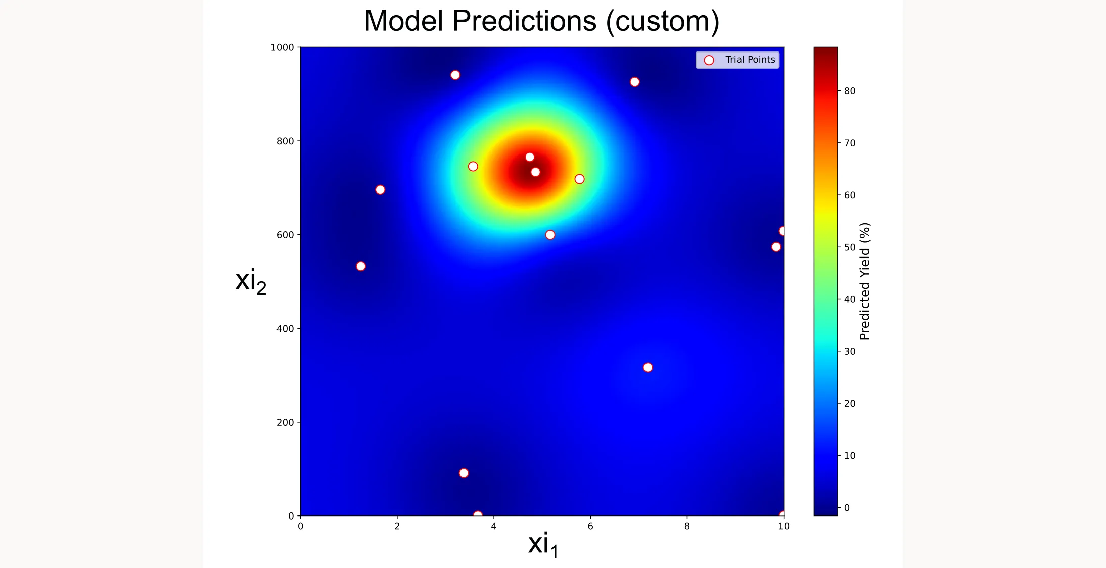
This custom heatmap shows exactly what the GP model has learned. You can see the high-yield region that the optimization has identified, and how the trial points (white dots with red borders) cluster around the optimum as the algorithm focuses its search.
If you want access to the full code I use in this article, you can find it here.