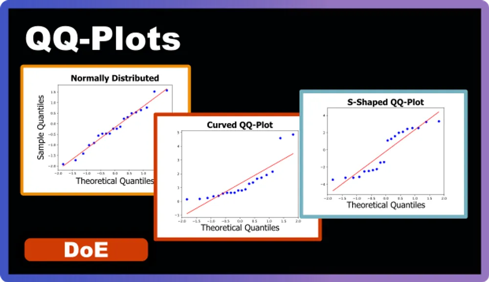
QQ-Plots Explained
After performing an ANOVA analysis, it is crucial to validate the assumptions that underlie the statistical model we have created. One powerful tool for this purpose is the Quantile-Quantile plot, or QQ-Plot. In this post, we’ll explore what a QQ-Plot is, how it works, and why it is a vital part of the model validation process in DoE.
What is a QQ-Plot?
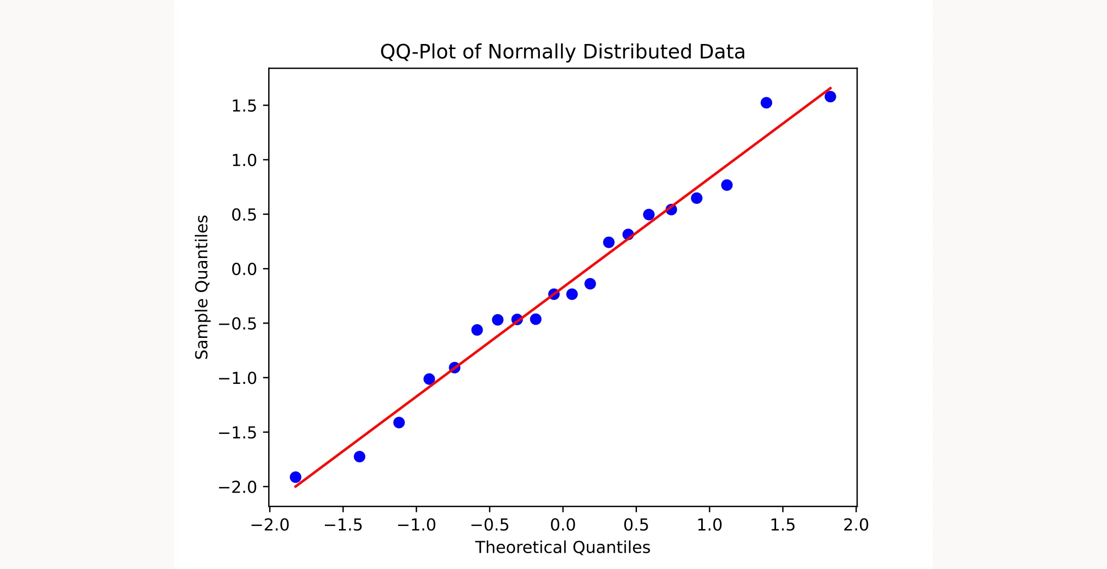
A QQ-Plot is a graphical tool that helps you determine whether your data follows a theoretical distribution, such as the normal distribution. It plots the quantiles of your actual data against the quantiles of the theoretical distribution. When your data follows the expected distribution, the points on the QQ-Plot form an approximately straight line.
What is a Normal Distribution?
A normal distribution (also called a Gaussian distribution) is a continuous probability distribution with a symmetric, bell-shaped curve. It describes how data points scatter around a central value—the mean. In experimental design, the random error in your response variable typically follows a normal distribution.
Think about measuring the temperature of a chemical reaction multiple times. Most readings cluster around the average temperature, with fewer readings at the extremes (much higher or lower). When you plot these measurements, they form the characteristic symmetric, bell-shaped curve.
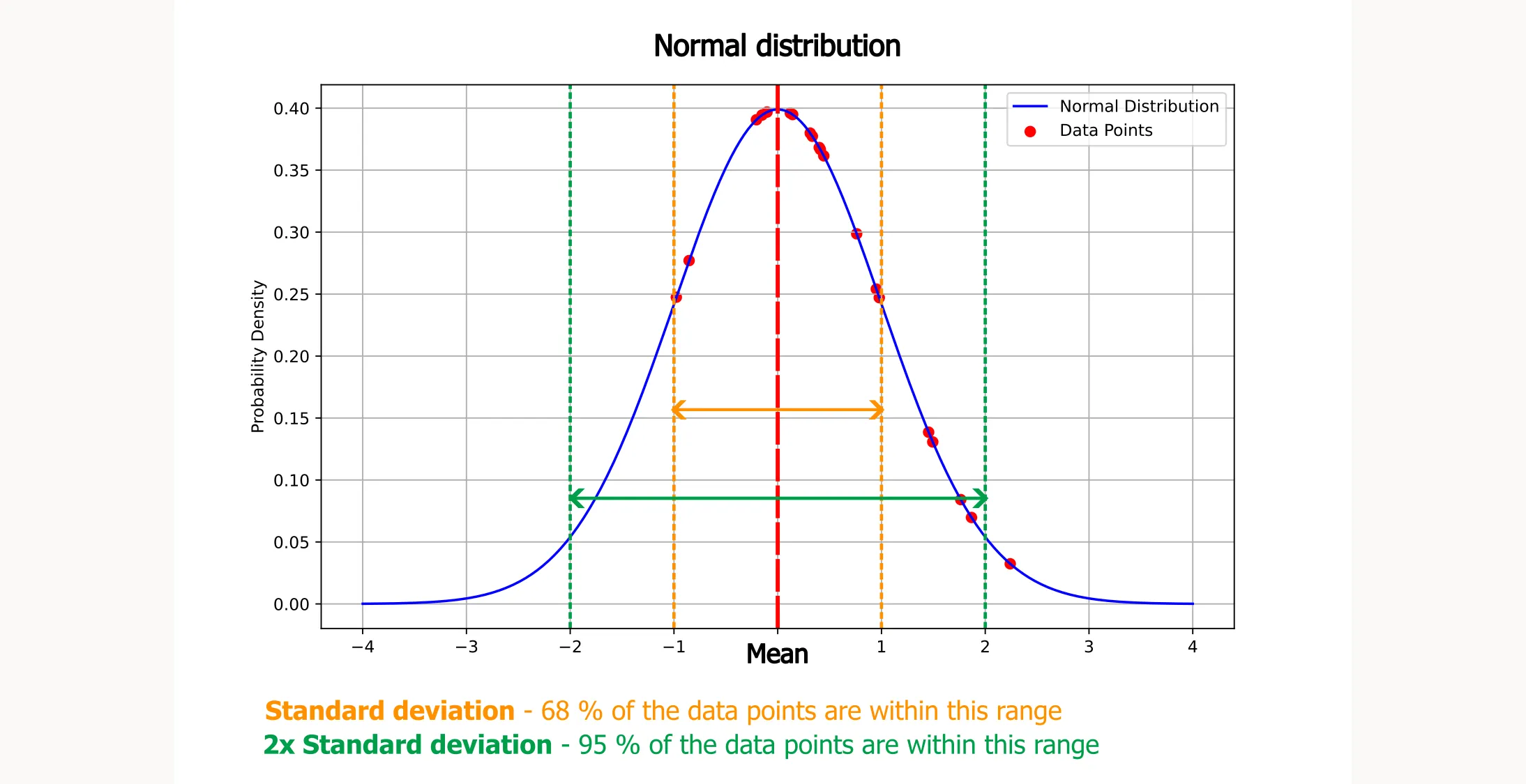
Key points about a normal distribution:
- Symmetry: The left side of the curve mirrors the right side.
- Mean: The center of the curve represents the average value.
- Frequency: Values closer to the mean are more common, while values further from the mean are less common.
The normal distribution has a predictable pattern that lets you estimate the likelihood of specific measurements:
- About 68% of the data falls within one standard deviation of the mean
- About 95% of the data falls within two standard deviations of the mean
Once you know the mean and standard deviation of your reaction temperatures, you can predict the probability of future readings falling within specific ranges. This predictability helps you understand and control the consistency of your chemical processes.
What are Quantiles?
Quantiles divide a probability distribution into intervals with equal probabilities, or in other words, they devide your data into equal-sized, consecutive subsets. Here are some common quantiles:
- Median (50th percentile): The middle value that separates the higher half from the lower half of your dataset
- Quartiles (25th and 75th percentiles): Values that divide the data into four equal parts
- Percentiles: Values that divide the data into 100 equal parts
For example, the 25th percentile (first quartile) is the value below which 25% of your data falls. You can calculate these quantiles for both your actual data and for perfectly normally distributed data, then compare them in a QQ-Plot. This comparison reveals how closely your data follows a normal distribution.
Why is the QQ-Plot Important?
ANOVA and other parametric tests rely on a key assumption: the residuals (differences between observed and predicted values) must be normally distributed. When residuals follow a normal distribution, you get reliable p-values and confidence intervals, which support valid conclusions from your analysis. Put simply: ANOVA works correctly only when the residuals are normally distributed.
QQ-Plots excel at detecting deviations from the theoretical distribution, making it straightforward to assess whether your data meets the normality assumption.
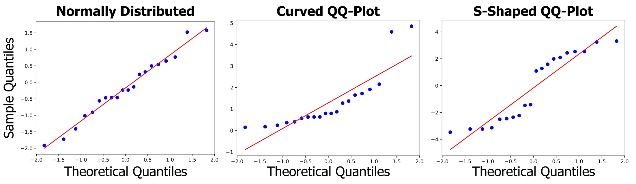
Ideal Case
When your data perfectly follows the theoretical distribution, the QQ-Plot forms a straight line at a 45-degree angle.
Deviations from the Ideal Case
- S-Shape: Indicates lighter tails than the normal distribution
- Inverted S-Shape: Indicates heavier tails than the normal distribution
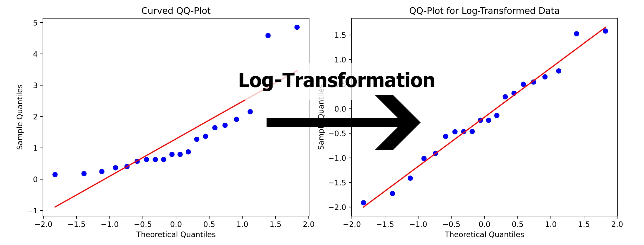
- Curved Upwards: Suggests a right-skewed distribution
- Curved Downwards: Suggests a left-skewed distribution
Model Improvement
When you identify these deviations, you can take steps to improve your model. If your data isn’t normally distributed, consider transforming your data or check whether you’ve forgotten to include some interaction terms.
If these approaches don’t work, standard ANOVA might not be the right tool for your model—but hopefully it won’t come to that.