
A full factorial design in Python from beginning to end
Commercial DoE and statistical software are incredibly powerful, but they also come with a hefty price tag. In addition, such software can be pretty daunting because of their many features of which you 80% probably don’t need.
Therefore, I was experimenting with python instead and here is the first result of how you can use it to perform a 2-level full factorial design. Feel free to use and adapt the functions here to your needs.
Packages
from pyDOE2 import fullfact
import numpy as np
import pandas as pd
import matplotlib.pyplot as plt
import itertools
import math
from statsmodels.formula.api import ols
import statsmodels.api as sm
from mpl_toolkits.mplot3d import Axes3D
First, we load all the required packages:
-
from pyDOE2 import fullfact: pyDOE2 is a library for designing experiments, andfullfactgenerates full factorial designs. This function creates a matrix where each row represents an experimental run, and each column represents a factor level, covering all possible combinations of factor levels. -
import numpy as np: NumPy is a fundamental package for scientific computing in Python. It’s commonly used for numerical computations. -
import pandas as pd: Pandas provides data structures and data analysis tools for Python. It excels at handling structured data, like experimental results stored in tables (DataFrames), and we’ll use it for data manipulation and analysis. -
import matplotlib.pyplot as plt: Matplotlib is a widely used plotting library for Python. It creates static, interactive, and animated visualizations. We’ll use thepltsubmodule for plotting graphs, such as bar charts and contour plots. -
import itertools: The itertools module provides tools for handling iterators. In experimental design, we’ll use it to generate combinations of factor levels. -
import math: The math module provides access to mathematical functions. -
from statsmodels.formula.api import ols: Statsmodels is a Python module that provides classes and functions for estimating statistical models, conducting statistical tests, and exploring data. Theolsfunction from the formula.api submodule fits Ordinary Least Squares regression models. -
import statsmodels.api as sm: This import also brings in statsmodels but gives us access to a broader range of statistical models, tests, and data exploration tools beyond just OLS, such as ANOVA. -
from mpl_toolkits.mplot3d import Axes3D: mpl_toolkits.mplot3d is a matplotlib submodule that provides basic 3D plotting capabilities, like 3D scatter plots and surface plots.Axes3Dcreates a 3D axes object for 3D plotting.
These packages provide a complete toolkit for factorial design experiments: from initial design (pyDOE2), through data manipulation and analysis (pandas, numpy, and statsmodels), to visualization and diagnostic plots (matplotlib and mpl_toolkits.mplot3d).
Experimental plan
def create_full_factorial_design(factors, randomize=False):

    # Create a 2-level full factorial design
    design = fullfact([2]*len(factors))

    # Convert levels from 0/1 to -1/+1
    design = 2*design - 1

    # Convert design matrix to a DataFrame
    df = pd.DataFrame(design, columns=factors)

    # Randomize the design if needed
    if randomize:
        df = df.sample(frac=1).reset_index(drop=True)

    return df
Next, we’ll create our experimental design plan. The create_full_factorial_design function creates a 2-level full factorial design plan. It builds on the pyDOE2 package but with a more user-friendly interface. Here’s how it works:
1. Function Definition
The function create_full_factorial_design is defined with two parameters:
factors: A list of strings representing the names of the factors in the experimentrandomize: A boolean value indicating whether the order of runs in the factorial design should be randomized. The default value isFalse, meaning no randomization unless specified
2. Creating the Full Factorial Design
The function creates a 2-level full factorial design matrix using the fullfact function. The fullfact function needs a list where each element represents the number of levels for a factor. Since we’re creating a 2-level design, [2]*len(factors) creates a list with the number 2 for each factor, indicating two levels for each factor.
The resulting design matrix, design, contains rows representing different runs or experiments, and columns representing the factors. Initially, the levels are coded as 0 and 1.
3. Converting Levels to -1 and +1
The code design = 2*design - 1 transforms the level coding from 0/1 to -1/+1, which is standard practice in factorial designs because it simplifies the analysis. This step changes the lower level (0) to -1 and the upper level (1) to +1.
4. Converting to DataFrame
The design matrix is then converted into a pandas DataFrame, df, with columns named according to the factors list. This makes further data manipulation and analysis easier, particularly when working with pandas.
5. Randomizing the Design
If the randomize parameter is set to True, the function randomizes the order of runs in the design matrix. This uses the sample method with frac=1, which shuffles the DataFrame rows. The reset_index(drop=True) part resets the DataFrame index without adding the old index as a column, keeping the original structure but in random order.
6. Returning the Design Matrix
Finally, the function returns the DataFrame df, which represents the 2-level full factorial design matrix with the specified factors as columns and the runs as rows, optionally randomized based on the randomize parameter.
How to apply the function create_full_factorial_design()
factors = ['T', 'P', 'CoF', 'RPM']
df = create_full_factorial_design(factors, randomize=False)
# Save the design to an Excel file
df.to_excel('full_factorial_design_filtration_rate.xlsx', index=False)
The code above shows how to use the function to generate a full factorial design matrix for an experiment. This specific example involves four factors: Temperature (T), Pressure (P), Concentration (CoF) and Revolutions per minute (RPM). The experimental design relates to the filtration rate example discussed in earlier articles. Here’s a step-by-step explanation:
1. Defining Factors
The first line factors = ['T', 'P', 'CoF', 'RPM'] defines a list of factor names. Each element represents a different factor to include in the factorial design. The choice of factors depends on what you think could influence the response variable—in this case, the filtration rate.
2. Generating the Design Matrix
The second line df = create_full_factorial_design(factors, randomize=False) calls the previously discussed function create_full_factorial_design with the list of factors as its first argument. The second argument, randomize=False, specifies that the order of the runs (or experimental conditions) in the design matrix should not be randomized. This means the experiments will be listed in a standard order based on the levels of the factors.
The function returns a pandas DataFrame df that contains the full factorial design matrix. Each row in this DataFrame represents an experimental run with specific levels (either -1 or +1) for each of the factors ‘T’, ‘P’, ‘CoF’, and ‘RPM’. The design covers all possible combinations of these levels across all factors.
3. Exporting the Design Matrix to Excel
The final line df.to_excel('full_factorial_design_filtration_rate.xlsx', index=False) uses the to_excel method of the pandas DataFrame to save the design matrix to an Excel file named 'full_factorial_design_filtration_rate.xlsx'. The index=False parameter is included to prevent pandas from writing the DataFrame index as a separate column in the Excel file. This results in a cleaner design matrix where only the columns for the factors are included.
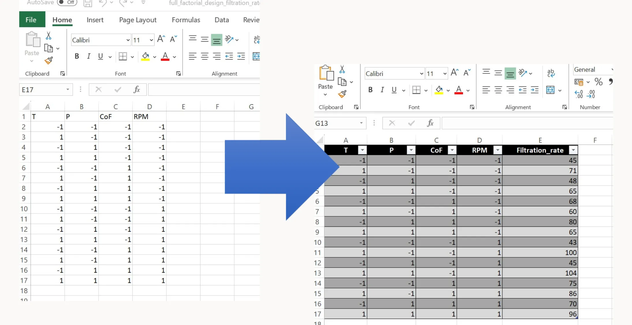
You can now execute this experimental plan in the lab. Run each experiment one at a time, measure the filtration rate, and record the results in a separate column of the Excel file.
Visualization
After performing the experiments and recording the results (filtration rate is our only response variable in this example), we can analyze the data using some simple visualizations.
Main Effects
def main_effects_plot(excel_file, result_column):
    # Load data from excel
    df = pd.read_excel(excel_file)

    # Identify factors by excluding the result column
    factors = [col for col in df.columns if col != result_column]

    # Calculate main effects
    main_effects = {}
    for factor in factors:
        mean_plus = df[df[factor] == 1][result_column].mean()
        mean_minus = df[df[factor] == -1][result_column].mean()
        main_effects[factor] = mean_plus - mean_minus

    # Plot main effects
    fig, ax = plt.subplots(figsize=(5, 5))
    ax.bar(main_effects.keys(), main_effects.values())

    # Annotate the bars with their values
    for factor, value in main_effects.items():
        ax.text(factor, value + 0.01 * abs(value), '{:.2f}'.format(value), ha='center', va='bottom')

    ax.set_ylabel('Main Effect')
    ax.set_title('Main Effects Plot')
    plt.xticks(rotation=45, ha="right")
    plt.show()
The main_effects_plot function loads experimental data from an Excel file, calculates the main effects of each factor on a specified result, and plots these main effects in a bar chart. Here’s how the function works:
1. Defining the function
main_effects_plot is defined with two parameters:
excel_file: The path to an Excel file containing the experimental dataresult_column: The name of the column in the Excel file that contains the result or response variable of the experiment
2. Loading Data
The line df = pd.read_excel(excel_file) uses pandas read_excel function to load the experimental data from the specified Excel file into a DataFrame df. This DataFrame includes both the factors and the result column.
3. Identifying Factors
Factors are identified by excluding the result column from the list of DataFrame columns. This is done using a list comprehension: [col for col in df.columns if col != result_column]. The resulting list, factors, contains the names of all columns except the result column, assuming these to be the factors in the experiment.
4. Calculating Main Effects
The function then iterates over each factor to calculate its main effect. The main effect of a factor is determined by the difference in the mean of the result variable when the factor is at its high level (coded as +1) and its low level (coded as -1).
For each factor:
mean_plusis the mean of the result column where the factor level is +1mean_minusis the mean of the result column where the factor level is -1
The difference mean_plus - mean_minus represents the main effect of the factor, which is stored in a dictionary main_effects with the factor names as keys.
5. Plotting Main Effects
A bar chart is created to visualize the main effects using matplotlib. The fig, ax = plt.subplots(figsize=(5, 5)) line initializes a figure and a single subplot with a specified size.
The main effects are plotted as bars with ax.bar(main_effects.keys(), main_effects.values()), where the keys of the main_effects dictionary (factor names) are used as the bar labels and the values (main effects) determine the height of the bars.
6. Annotating the Bars
Each bar is annotated with its value using a loop that goes through each factor, value pair in the main_effects dictionary. The ax.text method places a text label (formatted to two decimal places) just above each bar to indicate the main effect’s magnitude.
7. Customizing the Plot
- The y-axis is labeled as ‘Main Effect’
- A title ‘Main Effects Plot’ is set for the plot
- The x-ticks, which represent the factor names, are rotated 45 degrees to the right (
plt.xticks(rotation=45, ha="right")) for better readability
8. Displaying the Plot
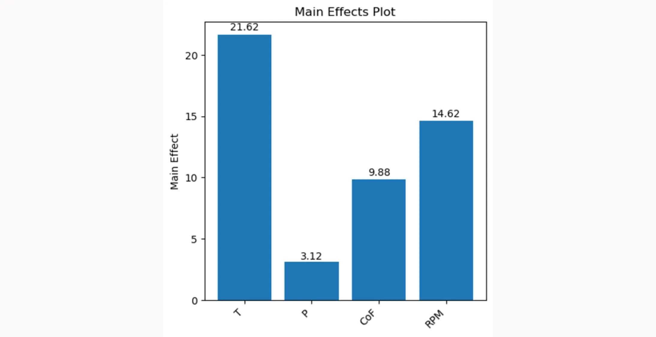
Finally, plt.show() displays the plot with the main effects of each factor. This visual representation helps you understand which factors have the most significant impact on the result variable. The height and direction of the bars indicate positive or negative main effects.
How to apply the function main_effects_plot()
excel_file = 'full_factorial_design_filtration_rate_results.xlsx'
result_column = 'Filtration_rate'
main_effects_plot(excel_file, result_column)
The code above shows how the main_effects_plot function is used:
1. Specifying the Excel File
excel_file = 'full_factorial_design_filtration_rate_results.xlsx' assigns the string containing the file name of the Excel file to the variable excel_file. This Excel file is expected to contain the results of a full factorial design experiment, including the levels of each factor for every experimental run and the corresponding results for the 'Filtration_rate'.
2. Identifying the Result Column
result_column = 'Filtration_rate' sets the name of the column in the Excel file that contains the response variable data. In this case there is a column named 'Filtration_rate' in the Excel file that contains the result values that we are interested in.
3. Executing the Main Effects Plot Function
main_effects_plot(excel_file, result_column) calls the main_effects_plot function, passing the path to the Excel file and the name of the result column as arguments. This function will then execute the steps that are described above and generate and display a bar chart that visualizes the main effects. Each bar represents a factor, and the height of the bar indicates the magnitude of the factor’s main effect on the 'Filtration_rate'. Positive values indicate an increase in the 'Filtration_rate' when the factor is at its high level, while negative values indicate a decrease.
Interactions
def interaction_point_plot(excel_file, result_column):
    df = pd.read_excel(excel_file)
    factors = [col for col in df.columns if col != result_column]
    interactions = list(itertools.combinations(factors, 2))

    # Calculate number of rows and columns for subplots
    cols = 3
    rows = math.ceil(len(interactions) / cols)
    fig, axs = plt.subplots(rows, cols, figsize=(10, 10*rows/3))

    for idx, interaction in enumerate(interactions):
        row = idx // cols
        col = idx % cols

        ax = axs[row, col] if rows > 1 else axs[col]

        for level in [-1, 1]:
            subset = df[df[interaction[0]] == level]
            ax.plot(subset[interaction[1]].unique(), subset.groupby(interaction[1])[result_column].mean(), 'o-', label=f'{interaction[0]} = {level}')

        ax.set_title(f'{interaction[0]} x {interaction[1]}')
        ax.legend()
        ax.grid(True)

    # Handle any remaining axes (if there's no data to plot in them)
    for idx in range(len(interactions), rows*cols):
        row = idx // cols
        col = idx % cols
        axs[row, col].axis('off')

    plt.tight_layout()
    plt.show()
After plotting the main effects, we can use interaction_point_plot to explore potential two-way interactions in our factorial design. This function takes the same two parameters as the main effects plot function: excel_file and result_column.
Here’s how the function works:
1. Loading Data and Identifying Factors
pd.read_excel(excel_file): This line reads the experimental data from the specified Excel file into a DataFrame- Factor Identification: A list comprehension creates a list of factor names, which includes all columns in the DataFrame except the one specified in
result_column
2. Generating Factor Combinations for Interactions
interactions = list(itertools.combinations(factors, 2)): This line utilizes the combinations function from Python’s itertools module to generate all possible unique pairs of factors. These pairs represent the 2-way interactions we aim to analyze.
3. Setting Up the Plot Layout
- The code calculates the number of rows needed for subplotting, ensuring all interaction pairs have a dedicated plot
plt.subplots(rows, cols, figsize=(10, 10*rows/3)): Initializes a grid of subplots with appropriate dimensions. Thefigsizeis set to maintain a consistent and readable plot size regardless of the number of rows
4. Plotting Each Interaction Pair
- The function iterates over each interaction pair, plotting them in their respective subplot locations
- Within each plot, it further iterates over the two levels (low and high, represented by
[-1, 1]) of the first factor in the pair - The mean of the result column for each level of the second factor is calculated using
subset.groupby(interaction[1])[result_column].mean(). This mean represents the average response at each combination of factor levels
5. Enhancing Plot Readability
- Titles, legends, and grid lines are added to each subplot for clarity
- Extra subplots (if any) are disabled using
axs[row, col].axis('off')to maintain a clean layout
6. Final Adjustments and Display
plt.tight_layout()adjusts the spacing between plots to avoid overlapping elementsplt.show()displays the complete set of interaction plots, offering a visual representation of how each pair of factors interacts and affects the response variable
How to apply the function interaction_point_plot()
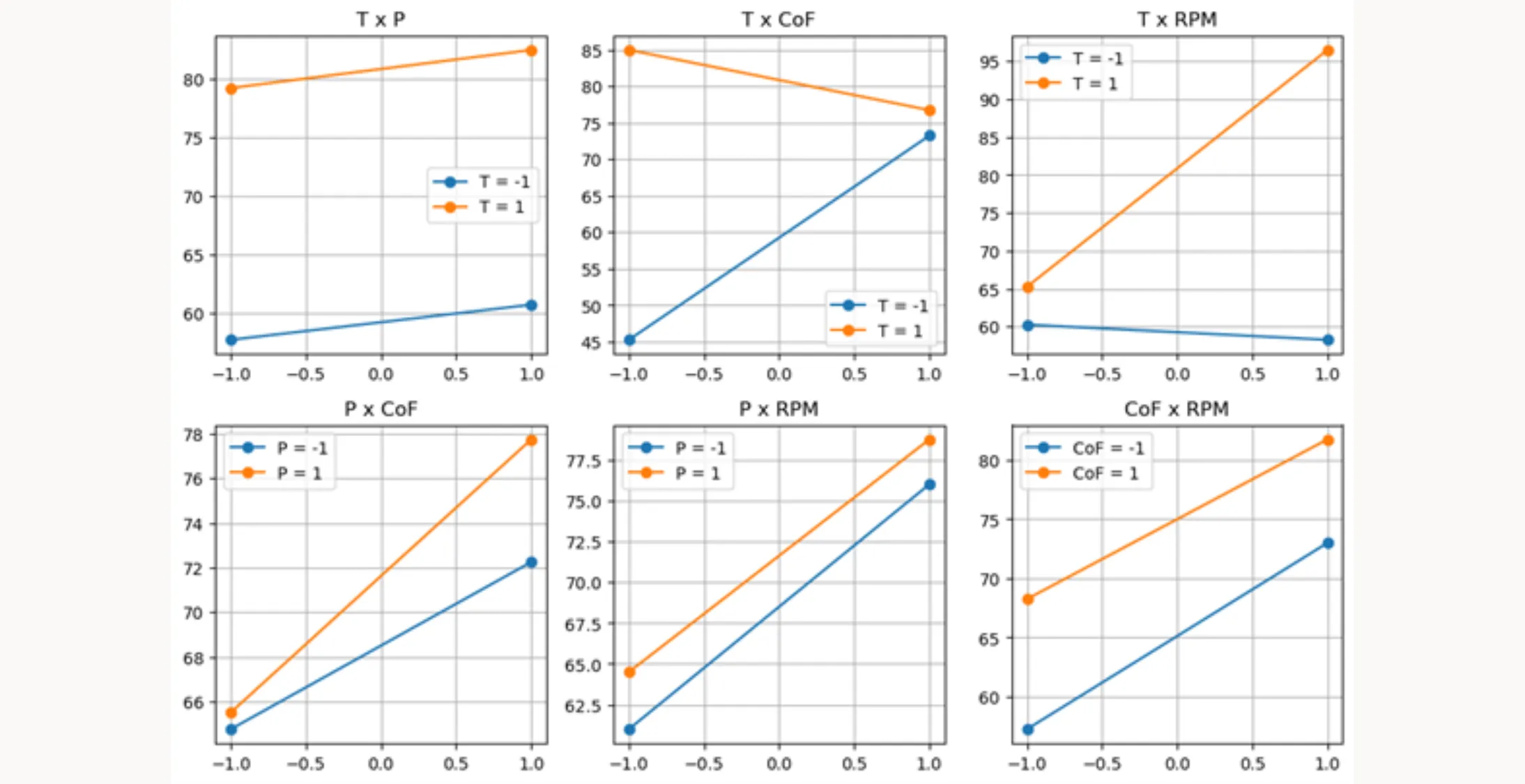
interaction_point_plot(excel_file, result_column)You can use this function similarly to the main_effects_plot function above. It creates a point plot where the relationship between factors is shown by the behavior of the lines. Parallel lines suggest no interactions between factors, while diverging, converging, or crossing lines indicate significant interactions.
Model Building / ANOVA
df = pd.read_excel(excel_file)

# Fit the model
formula = 'Filtration_rate ~ T + CoF + P + RPM + T:CoF + T:RPM'
model = ols(formula, data=df).fit()

# Perform ANOVA and print the results
anova_table = sm.stats.anova_lm(model, typ=1)
anova_table
After getting an overview of the data, we can build our statistical model. The process involves fitting a linear model to the data and then conducting ANOVA to test the significance of each factor and interaction. This lets us verify the assumptions we formed during the visualization step. Here’s the breakdown:
1. Loading Data
df = pd.read_excel(excel_file) loads the experimental data from the Excel file (specified by the variable excel_file) into a pandas DataFrame df.
2. Fitting the Linear Model
The formula = 'Filtration_rate ~ T + CoF + P + RPM + T:CoF + T:RPM' line defines the model formula. This formula specifies that the 'Filtration_rate' is modeled as a function of:
- Main effects:
'T','CoF','P'and'RPM' - Interactions:
'T:CoF'and'T:RPM'
The '+' symbol adds main effects, and ':' specifies interactions between factors.
model = ols(formula, data=df).fit() fits an Ordinary Least Squares (OLS) regression model using the specified formula. The ols function from the statsmodels library is used here, with data=df indicating that the data for the model comes from the DataFrame df. The .fit() method fits the model to the data and returns the fitted model object model.
3. Performing ANOVA
anova_table = sm.stats.anova_lm(model, typ=1) performs ANOVA on the fitted model model using Type I sum of squares. This function is part of the statsmodels library (abbreviated as sm). The anova_lm function computes the ANOVA table for the model, which includes statistics such as:
- Sum of squares
- Degrees of freedom
- Mean square
- F-value
- P-value for each factor and interaction in the model
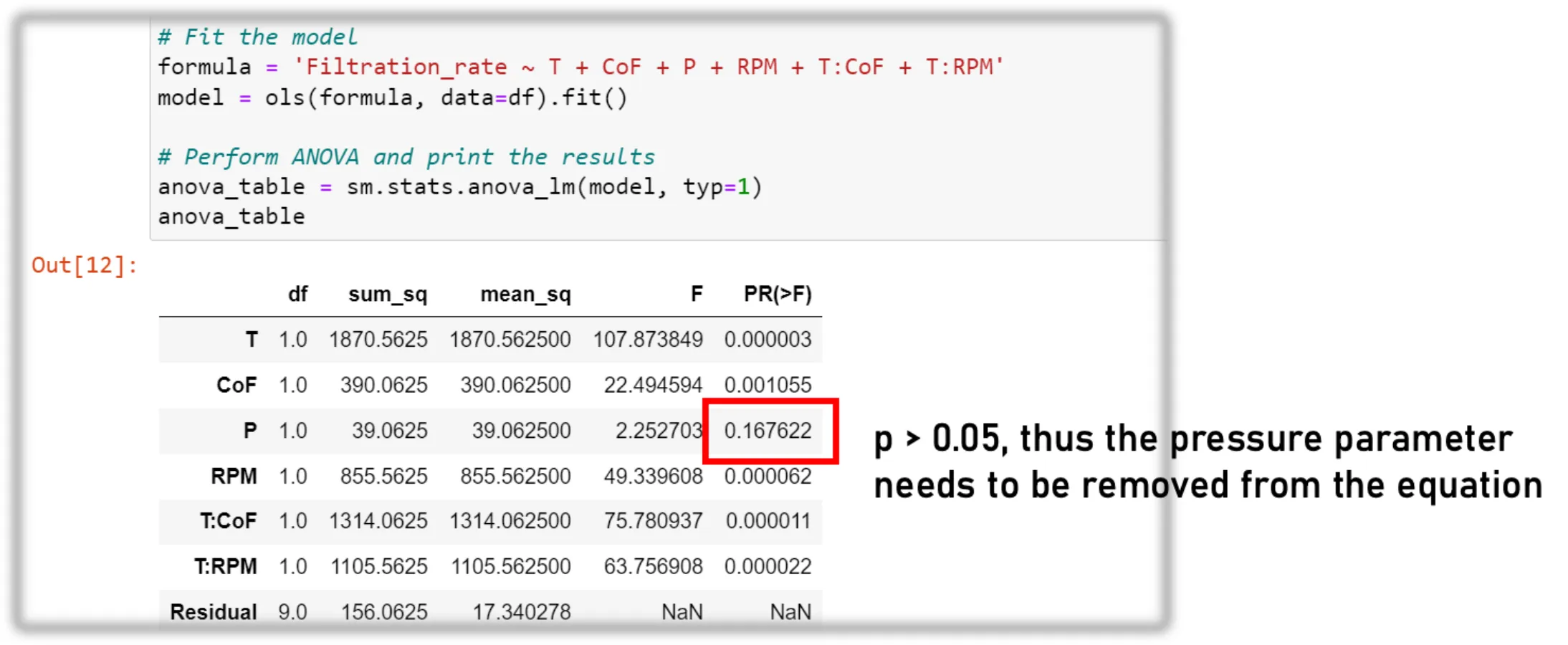
The ANOVA table, stored in anova_table, helps determine the statistical significance of each factor and interaction’s effect on the response variable. A low P-value (typically <0.05) indicates that a factor or an interaction has a statistically significant effect on the response variable.
4. Iteration
This is an iterative process. You optimize the formula in step 2 until it contains only significant parameters (p-value < 0.05). The visualization you performed earlier gives a good indication of which parameters might be significant and which are not.
Model Control
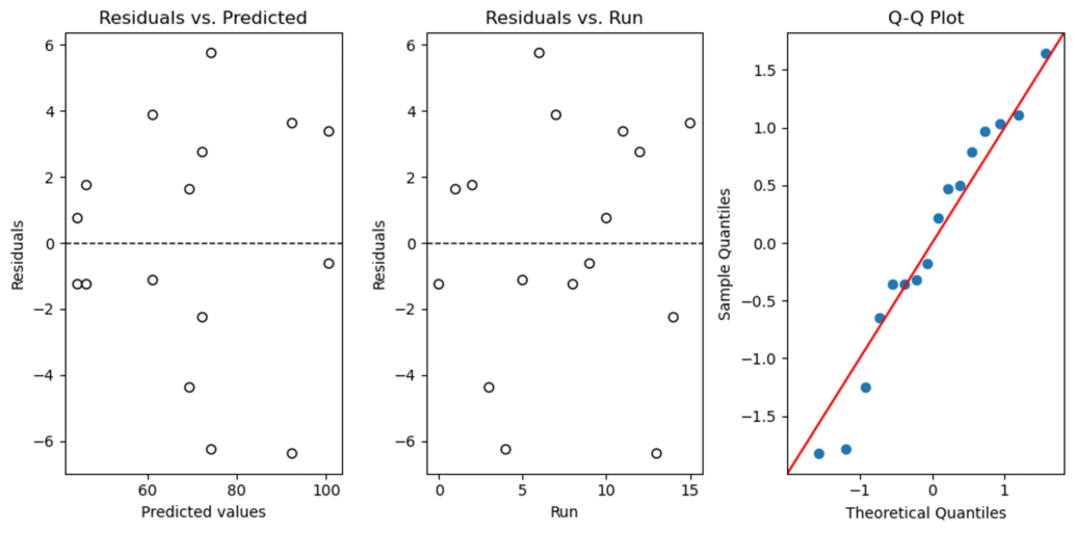
The model diagnostics step follows model building. The diagnostic_plots function creates three diagnostic plots to assess how well our model fits the data. Here’s a breakdown of the code:
def diagnostic_plots(model):
    # Extract residuals and predicted values from the model
    residuals = model.resid
    predicted = model.fittedvalues

    # Create subplots
    fig, axs = plt.subplots(1, 3, figsize=(10, 5))

    # Residuals vs Predicted
    axs[0].scatter(predicted, residuals, edgecolors='k', facecolors='none')
    axs[0].axhline(y=0, color='k', linestyle='dashed', linewidth=1)
    axs[0].set_title('Residuals vs. Predicted')
    axs[0].set_xlabel('Predicted values')
    axs[0].set_ylabel('Residuals')

    # Residuals vs. Runs (Order of Data Collection)
    axs[1].scatter(range(len(residuals)), residuals, edgecolors='k', facecolors='none')
    axs[1].axhline(y=0, color='k', linestyle='dashed', linewidth=1)
    axs[1].set_title('Residuals vs. Run')
    axs[1].set_xlabel('Run')
    axs[1].set_ylabel('Residuals')

    # Q-Q plot
    sm.qqplot(residuals, line='45', fit=True, ax=axs[2])
    axs[2].set_title('Q-Q Plot')

    plt.tight_layout()
    plt.show()
1. Function Definition
diagnostic_plots(model) defines the function with a single parameter model, which is the fitted linear model from the previous model building step. It contains all the necessary information to create the diagnostic plots.
2. Extracting Residuals and Predicted Values
residuals = model.residextracts the residuals from the model, which are the differences between the observed and predicted valuespredicted = model.fittedvaluesextracts the predicted values from the model, which are the values predicted by the regression line
3. Setting Up Subplots
fig, axs = plt.subplots(1, 3, figsize=(10, 5)) initializes a figure with a 1x3 grid of subplots (i.e., three plots in a row) and sets the figure size.
4. Plotting Residuals vs. Predicted
The first subplot (axs[0]) is a scatter plot of predicted values against residuals. Ideally, the points should be randomly dispersed around the horizontal line y=0, without any discernible pattern.
axs[0].axhline(y=0, ...) adds a horizontal dashed line at y=0 to help visualize the zero residual line.
5. Plotting Residuals vs. Runs
The second subplot (axs[1]) is a scatter plot of the order of data collection (or “runs”) against residuals. This plot checks for any patterns in the residuals that may suggest dependence on the order of data collection, which could indicate time-related trends or serial correlation.
The residuals are plotted against range(len(residuals)), which generates a sequence of integers representing the order of data collection.
6. Q-Q Plot
The third subplot (axs[2]) is a Quantile-Quantile (Q-Q) plot generated by sm.qqplot(residuals, ...), used to assess the normality of the residuals. Points following a straight line (the 45-degree line indicated by line='45') suggest that the residuals are normally distributed.
7. Final Adjustments and Display
plt.tight_layout()adjusts the spacing between the subplots to prevent overlapplt.show()displays the figure with the three diagnostic plots
How to apply the function diagnostic_plots()
diagnostic_plots(model)The code diagnostic_plots(model) calls the function and passes the model object to it. This model object should be a fitted regression model from which the function extracts residuals and predicted values to generate the three diagnostic plots. If the diagnostic plots show problems, you may need to:
- Transform the data
- Add additional interaction terms
- Fit a higher order model (i.e., add a quadratic term)
However, the last option might require running additional experiments.
Concluding the Design
If the model diagnostics look good and you’re satisfied with the results, you can draw conclusions and prepare your results for a presentation or report. The following steps will help with that.
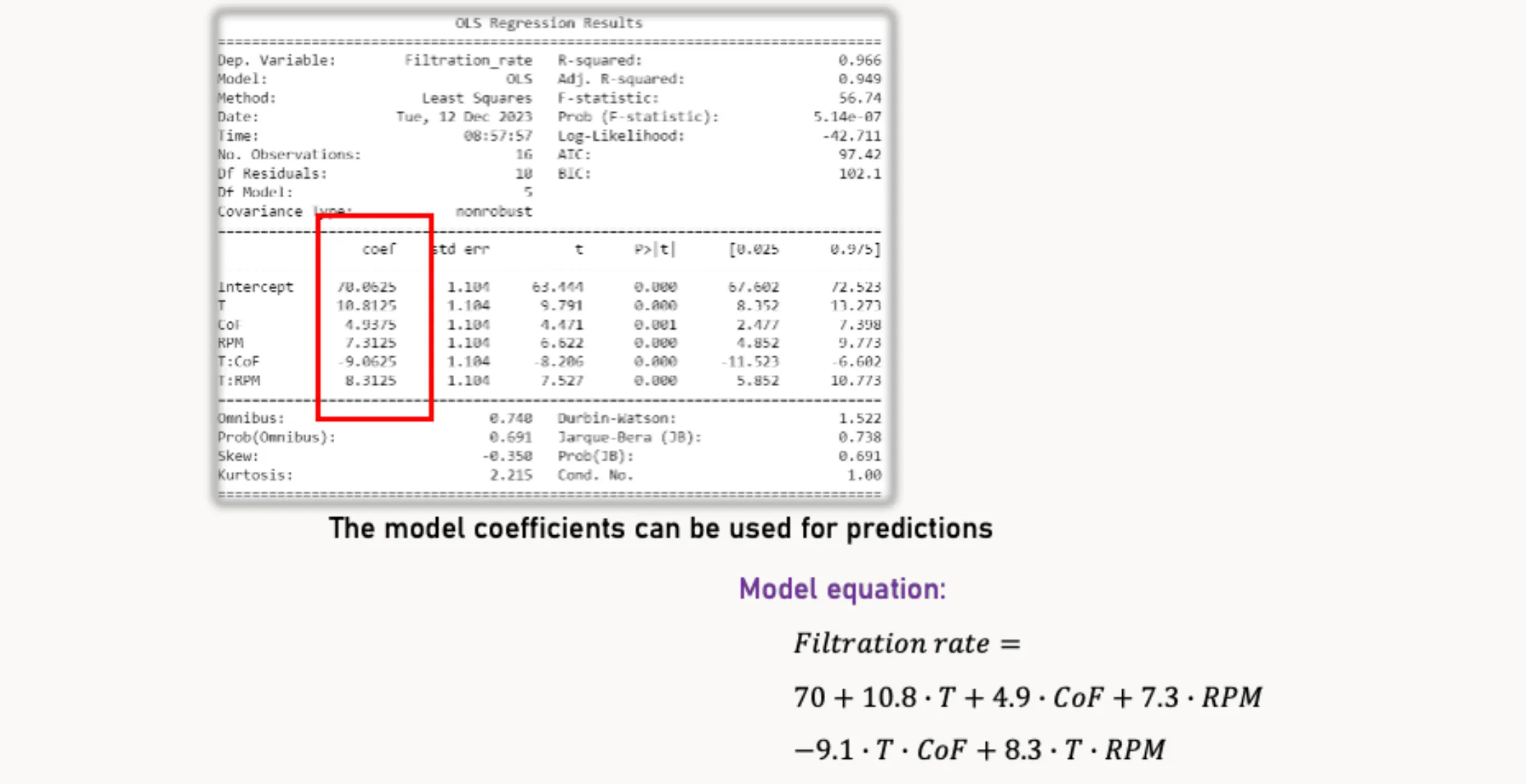
Model Summary
print(model.summary())The code print(model.summary()) displays a comprehensive summary with statistical and diagnostic information for the regression model stored in model. This summary includes:
- Key performance metrics of the model
- Statistical significance of each model coefficient
- The influence of individual factors and factor interactions on the filtration rate
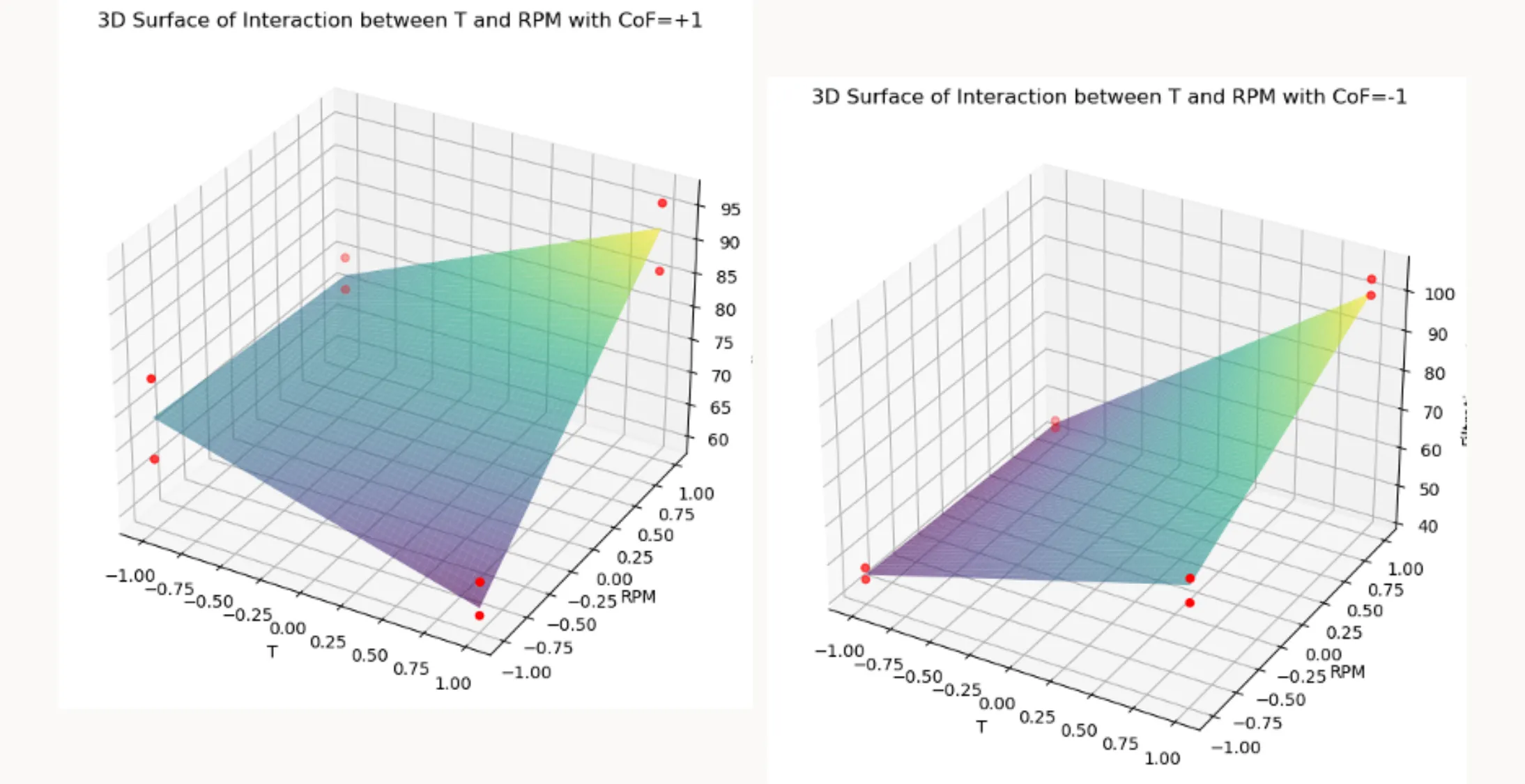
3D Plots
def plot_3D_surface(model, data, x_name, y_name, z_name, held_values: dict, title):
    # held_values: dict like {"CoF": +1, "P": 0} for coded factors
    x_range = np.linspace(-1, 1, 100)
    y_range = np.linspace(-1, 1, 100)
    x_grid, y_grid = np.meshgrid(x_range, y_range)

    # Build a base frame with ALL predictors the model expects
    needed = [v for v in model.model.exog_names if v not in ("Intercept", "const")]
    df_pred = pd.DataFrame({x_name: x_grid.ravel(), y_name: y_grid.ravel()})
    for v in needed:
        if v not in df_pred.columns:
            # if it's one of the held values, use that; otherwise default to 0 (center)
            df_pred[v] = held_values.get(v, 0)

    Z = model.predict(df_pred).values.reshape(x_grid.shape)

    fig = plt.figure(figsize=(10, 7))
    ax = fig.add_subplot(111, projection='3d')
    ax.plot_surface(x_grid, y_grid, Z, cmap='viridis', alpha=0.6)

    # overlay measured points at the same held settings (if you want)
    mask = np.ones(len(data), dtype=bool)
    for k, v in held_values.items():
        mask &= (data[k] == v)
    ax.scatter(data[mask][x_name], data[mask][y_name], data[mask][z_name], color='r', marker='o')

    ax.set_xlabel(x_name); ax.set_ylabel(y_name); ax.set_zlabel(z_name)
    ax.set_title(title)
    plt.show()
The plot_3D_surface function creates a 3D surface plot that visualizes the relationship between two factors and one response variable, while holding other factors constant. Here’s how it works:
1. Function parameters
model: Fitted regression model (e.g., fromstatsmodels).data: DataFrame with observed runs (used to overlay measured points).x_name,y_name,z_name: Names of the x-axis factor, y-axis factor, and response column.held_values: Dictionary of fixed settings for all other predictors (e.g.,{"CoF": +1, "P": 1}for coded data).
Any predictor not listed here defaults to0(the coded center).title: Plot title.
2. Prediction grid
- Builds a fine grid over
x_nameandy_namein coded units (−1…+1). - Uses
np.meshgridto create the 2D grid for surface prediction.
3. Preparing prediction data
- Extracts the predictor names the model expects (
model.model.exog_names, excluding the intercept). - Constructs
df_predwithx_name,y_name, and every other required predictor. - For each missing predictor, fills from
held_valuesif provided; otherwise uses0(coded center).
This ensuresmodel.predicthas all regressors the formula requires.
4. Predictions and plotting
- Computes
Z = model.predict(df_pred)and reshapes to the grid. - Plots the smooth response surface with
plot_surface.
5. Overlaying observed runs at the same held settings
- Builds a boolean mask over
datamatching all key–value pairs inheld_values. - Overlays the corresponding measured points to compare observations vs. fitted surface.
6. Labels and display
- Sets axis labels and title, then displays the plot.
How to apply the function plot_3D_surface()
plot_3D_surface(model, df, 'T', 'RPM', 'Filtration_rate',
                held_values={'CoF': +1, 'P': +1},
                title="3D Surface of Interaction between T and RPM with CoF=+1")
plot_3D_surface(model, df, 'T', 'RPM', 'Filtration_rate',
                held_values={'CoF': -1, 'P': +1},
                title="3D Surface of Interaction between T and RPM with CoF=-1")
This code shows how to use the plot_3D_surface function to visualize the interaction effects between two factors, ‘T’ and ‘RPM’, on the response variable ‘Filtration_rate’, while holding the other predictors constant using the held_values dictionary. Here’s the breakdown:
1. First Plot
The function plot_3D_surface is called with:
- The fitted model
model - The dataset
df - The interacting factors
'T'and'RPM' - The response variable
'Filtration_rate' - The dictionary
held_values={'CoF': +1, 'P': +1}
This means both 'CoF' and 'P' are held constant at +1, and the title
"3D Surface of Interaction between T and RPM with CoF=+1, P=+1"
is set.
2. Second Plot
A similar call is made, but with:
held_values={'CoF': -1, 'P': +1}
This keeps 'P' constant at +1 while changing 'CoF' to -1, producing a plot titled
"3D Surface of Interaction between T and RPM with CoF=-1, P=+1".
3. Interpretation
By creating these two plots, you can visually compare how the interaction between ‘T’ and ‘RPM’ influences the ‘Filtration_rate’ under two different conditions of ‘CoF’, while ‘P’ stays fixed at a constant level. This approach shows how changes in one factor can alter the relationship between two others in the model.
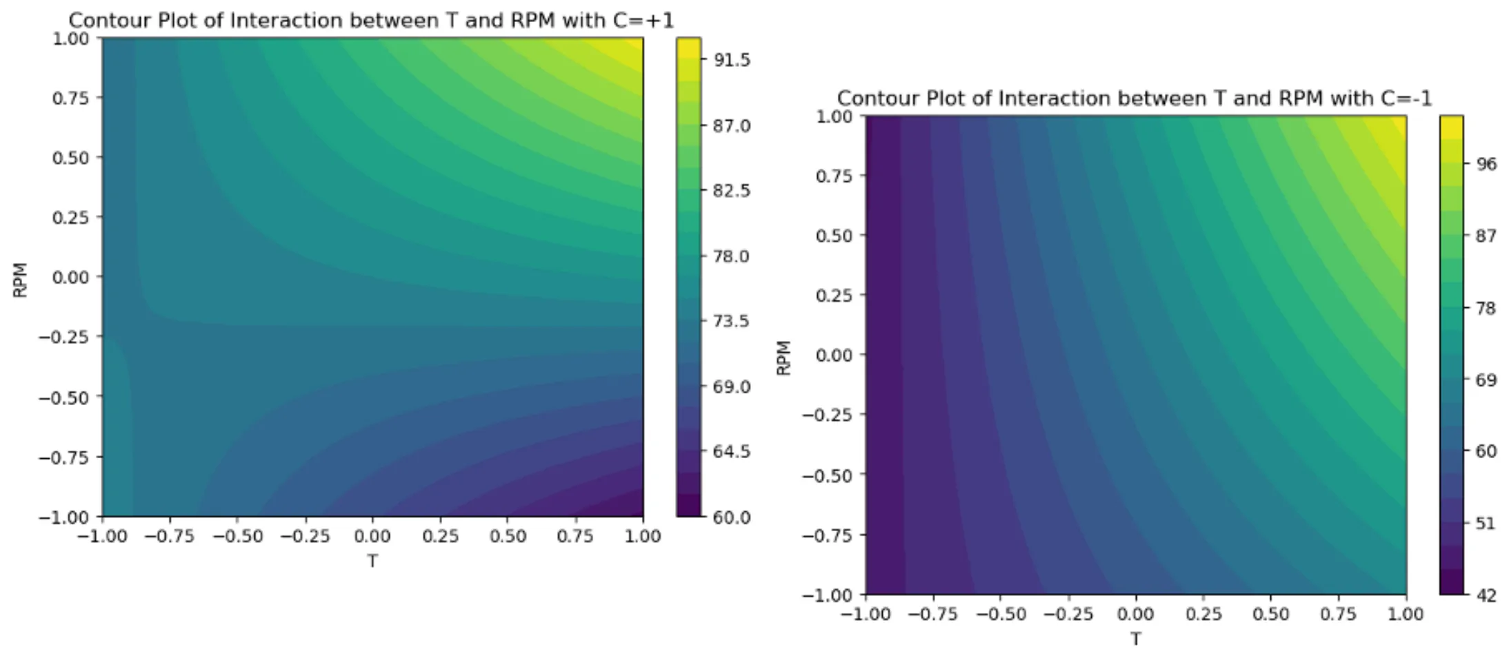
Contour Plots
# Function to create contour plot
def plot_contour(model, data, x_name, y_name, held_values: dict, title):
    x_range = np.linspace(-1, 1, 100)
    y_range = np.linspace(-1, 1, 100)
    x_grid, y_grid = np.meshgrid(x_range, y_range)

    needed = [v for v in model.model.exog_names if v not in ("Intercept", "const")]
    df_pred = pd.DataFrame({x_name: x_grid.ravel(), y_name: y_grid.ravel()})
    for v in needed:
        if v not in df_pred.columns:
            df_pred[v] = held_values.get(v, 0)

    Z = model.predict(df_pred).values.reshape(x_grid.shape)

    plt.figure(figsize=(7, 5))
    contour = plt.contourf(x_grid, y_grid, Z, 20, cmap='viridis')
    plt.colorbar(contour)
    plt.title(title)
    plt.xlabel(x_name); plt.ylabel(y_name)
    plt.show()
The plot_contour function creates a contour plot to visualize how two factors jointly affect a response variable, while holding other predictors constant using the held_values dictionary. It provides a 2D alternative to a 3D surface plot, making it easier to compare interaction effects.
1. Function parameters
model: Fitted regression model (e.g., fromstatsmodels).data: DataFrame containing the experimental data.x_name,y_name: Names of the two factors to be plotted on the x and y axes.held_values: Dictionary of fixed settings for all other predictors (e.g.,{"CoF": +1, "P": 0}for coded data).
Any predictor not listed defaults to0(the coded center).title: Title for the contour plot.
2. Setting up the grid
x_rangeandy_rangecreate arrays of 100 evenly spaced points between −1 and +1.np.meshgridcombines these ranges into two 2D grids representing all (x, y) coordinate pairs.
3. Preparing prediction data
-
Extracts the full list of predictor names from
model.model.exog_names, excluding the intercept. -
Builds a DataFrame
df_predwith columns forx_nameandy_name. -
For every predictor expected by the model but not in
df_pred, the function:- Inserts the corresponding value from
held_values, or - Defaults to
0if the predictor isn’t listed inheld_values.
This ensures
model.predictreceives all required predictors. - Inserts the corresponding value from
4. Generating predictions
- Uses
model.predict(df_pred)to compute predicted response values across the grid. - Reshapes predictions into a 2D array
Zmatching the grid structure.
5. Creating the contour plot
- Initializes a figure using
plt.figure. - Uses
plt.contourfto create a filled contour plot ofZacross the x–y grid. - Adds a color bar with
plt.colorbarto indicate response magnitude.
6. Customizing and displaying
- Sets plot title and axis labels.
- Calls
plt.show()to render the plot.
How to apply the function plot_contour()
plot_contour(model, df, 'T', 'RPM',
             held_values={'CoF': +1, 'P': +1},
             title="Contour Plot of Interaction between T and RPM with CoF=+1, P=+1")

plot_contour(model, df, 'T', 'RPM',
             held_values={'CoF': -1, 'P': +1},
             title="Contour Plot of Interaction between T and RPM with CoF=-1, P=+1")
1. First Contour Plot
- Holds ‘CoF’ = +1 and ‘P’ = +1 while varying ‘T’ and ‘RPM’.
- Produces the plot titled
”Contour Plot of Interaction between T and RPM with CoF=+1, P=+1”.
2. Second Contour Plot
- Holds ‘CoF’ = -1 and ‘P’ = +1 for comparison.
- Produces the plot titled
”Contour Plot of Interaction between T and RPM with CoF=-1, P=+1”.
Conclusion
This blog post showed how Python and its libraries provide a straightforward and cost-effective solution for conducting Design of Experiments (DoE) and statistical analysis. The functions demonstrated here make it easy to apply these techniques to your own projects.
Python’s versatility extends far beyond what we’ve covered here. It offers a broad range of:
- Statistical analysis capabilities
- Machine learning tools
- Data visualization libraries
This makes Python an invaluable tool for researchers and engineers, enabling sophisticated analyses and insightful visualizations that drive decision-making and innovation.
I’ll be exploring this further in future posts, so stay tuned!